
We are continuing our efforts to improve every area of the Artfacts experience, and we’ve now arrived at what some might call our most exciting feature: Analytics!
This is where we dig deep into the data to reveal trends and hidden details. We’ve only just started our work here, but we’re excited to release a new trend chart today. As you can see below, it’s not only aesthetically pleasing, it’s more precise than ever:
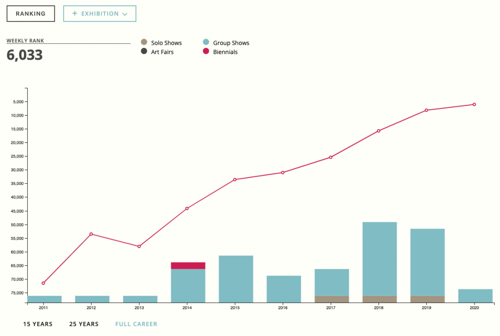
Not entirely sure what the Trends Chart is about?
Simply put: The trend chart shows an artist’s prominence over time.
It’s a way of communicating visually how we take the data of an artist’s career to calculate their ranking. This rank is measured predominantly by the exhibitions the artist is involved in: comparing the types of exhibitions and institutions, the other artists featured in group shows, and if the exhibitions are in foreign countries. This information is then used to calculate an artist rank relative to all other artists, with a rank of 1 being the most prominent artist.
But don’t stop there! Go on, explore the newly perspicuous exhibitions graph. Simply click the + Exhibitions button and you will discover that beneath the line graph illustrating the artists rank, there are now bar graphs, divided by year and composed of the types of exhibitions the artist was involved in.
“The unexamined life is not worth living” Socrates was onto something there wasn’t he?
We hope this brings you joy and new insight in exploring the world of art.